
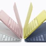
- The new interface, inspired by glass and gels, will be introduced on all supported Apple devices in a few months.
- User interfaces, across different operating systems, have evolved over time, with users adapting to quirks and changes.
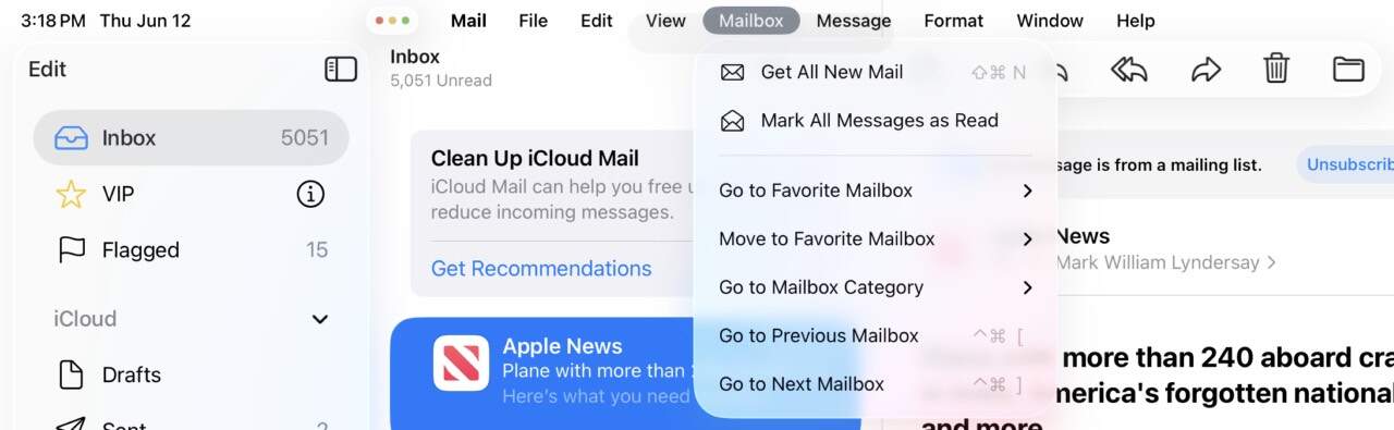
- Positives: Seamless upgrade process, new design elements, and a useful dropdown file menu that enhances app accessibility.
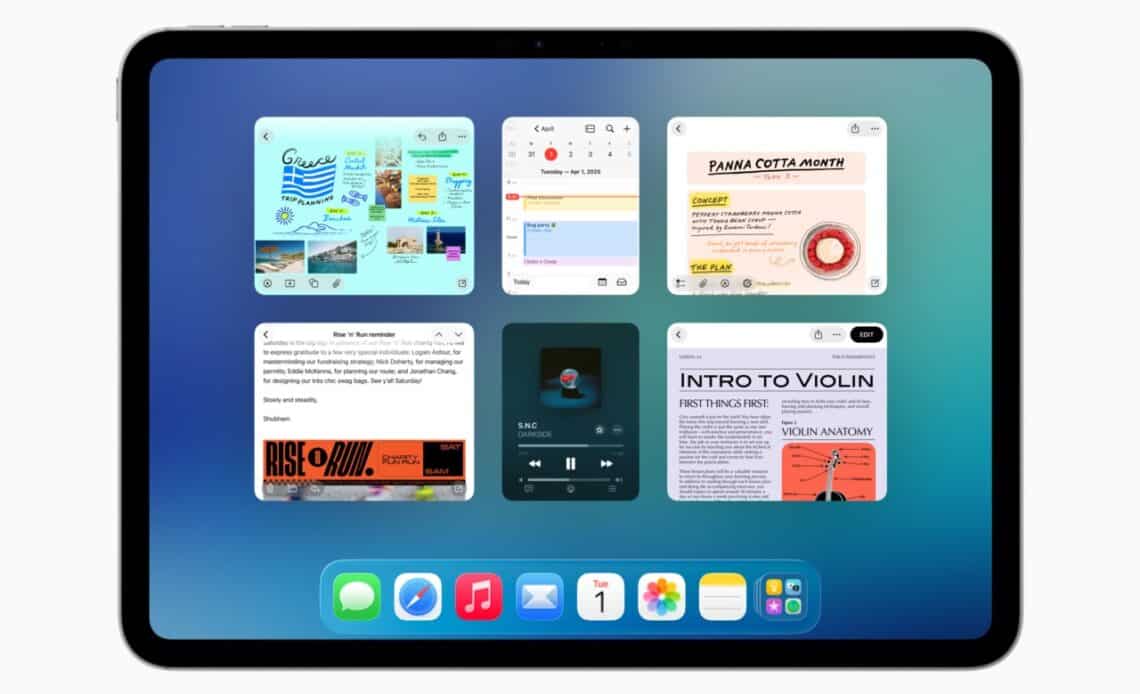
Above: Nobody should be getting excited about multi-tasking windows on iPad in 2025, but here we are. Image courtesy Apple.
BitDepth#1515 for June 16, 2025
Apple’s announcements at last week’s Worldwide Developer’s Conference (WWDC) offered few surprises to anyone who’s been using their devices.
Over the last ten years, the company has been quietly adding features and design cues from its handheld products (iPad, iPhone) to its desktop products (MacBook, iMac).
At first, the move seemed an acknowledgement of the dramatically larger market share and profitability of its iPhones and iPads, and touchscreen features appeared in MacOS with varying levels of success.
App portability, for instance, which allows apps purchased on the iPhone to run on the desktop proved a convenience, not a real world solution, the resulting apps appearing tiny and oddly sized on the Mac.
For the first time with its OS26 releases – renumbered across all versions of the company’s operating systems from iWatch to Vision Pro – MacOS features are showing up on touchscreen devices.
Some of the promised features are obvious, like adding a pop-up menu bar for app features and adjustable windows on an iPad, which always had the screen real estate to accommodate it.
In his keynote, even presenter-in-chief Craig Federighi, who’d cheerfully hammed his way through the entire 92 minute long reveal, had to admit with thinly veiled irony, “Wow. More windows. A pointier pointer and a menubar? Who would have thought…”
It was a quietly self-deprecating moment while announcing new features that include many that are overdue, obvious, long demanded and hardly user-interface revolutions.
So let’s take a moment to consider the new interface, which draws inspiration from both the translucency of glass and the fluidity of gels that will be introduced on all the company’s devices in a few months.
Dubbed “Liquid Glass,” the new design language has drawn comparisons with Windows Aero, Microsoft’s short-lived experiment with translucency in Windows Vista.
But it’s arguable that it’s actually a more mature and subtle callback to the very first OSX interface, Aqua, which seemed terribly impressive 25 years ago, particularly given its interface smoothness, powered by display PostScript, which leveraged the work that NeXT had been doing with that technology during Steve Jobs’ years in the technology wilderness.
Long after its introduction, Aqua’s look, which reflected the softer corners and plastic translucency of the iBooks and iMacs of that era also began to introduce brushed metal windows and other incongruities as the physical design of the devices began to move from plastic to titanium and aluminum.
Here’s the thing about user interfaces. I’ve used every MacOS from System 6 to Sequoia and dabbled with most Windows releases from 3.1 to Windows 11 Pro.
Two things are true across all that history. You use the interface on the device you have. Quirks are annoying, but you adjust to them over time until one day there’s a fix.
The real measure of the OS26 updates will be tested in daily use.
Will learned experiences on one device seamlessly carry over to another? Will features work the same way, within reason, regardless of which device it’s used on?
Will developers embrace this new design language? Will the theme make sense as a whole or will it just be a fancy skin with pretty 3D shading?
At one time or another, all of Apple’s OS releases have excelled and failed at these benchmarks.
Unifying user interface elements and responsiveness goes a long way toward creating at least an illusion that apps behave the same way on all the platforms they are deployed on.
Every change and every feature won’t matter to everyone. I’m pretty deeply invested in the Mac ecosystem, but even so, TVOS and VisionOS are just concepts to me.
Apple Intelligence is cute, but remains very much in development. Even the “Create Key Points” feature, which I use pretty regularly, isn’t as useful as it could be.
As sexy as Apple’s promotional videos for the new interface are, it wouldn’t be sensible to deploy the beta version of this new OS on a production system.
I tested the iPadOS beta on an older A12 powered iPad Pro and it’s a bit patchy at this point.
Upgrading to this major revision was seamless and apps reopened on the same document page. Apple’s new design cues such as the new icon styles are limited to its own apps and the interface seems to drop some flourishes on slower processors.
Adding that subtle dropdown file menu, even to older apps, is fire. Apps that I use on both the desktop and the tablet immediately feel more accessible on mobile.
It’s a subtle touch, but a practical one. On some third-party mobile apps there are no useful menu controls, making the feature useless.
The traffic light window controls are too small to target with an adult finger. You can only reliably tap them with a stylus or a trackpad-driven cursor.
Multitasking windows are crude but effective. If you’ve had to bounce between documents to get things done on an iPad, even this first effort dramatically improves the process.
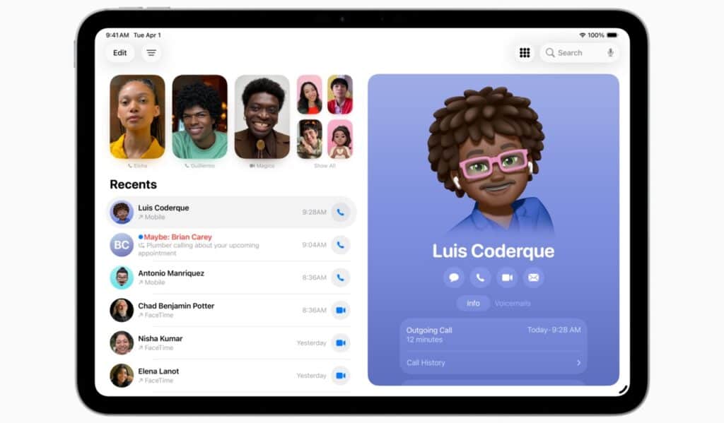
It was always possible to answer a call on a connected iPhone on the tablet, but the new Phone app allows you to place calls and access your contact list far more intuitively. The answer feature was also available on MacOS, but the full Phone app will be introduced there with MacOS Tahoe 26.
Beta systems can be great fun, but can also make a device unusable. If you choose to test (the upgrades appear to be available on all Apple Silicon devices) do so with caution and reliable backups.


 Is Apple’s Neo the One?
March 22, 2026
Is Apple’s Neo the One?
March 22, 2026
 Privacy and your travel information
March 15, 2026
Privacy and your travel information
March 15, 2026
 TATT announces ambitious three-year strategic plan
March 9, 2026
TATT announces ambitious three-year strategic plan
March 9, 2026
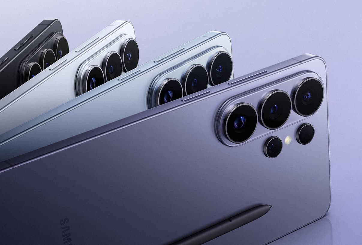
 Samsung’s S26 leans in hard on...
March 1, 2026
Samsung’s S26 leans in hard on...
March 1, 2026
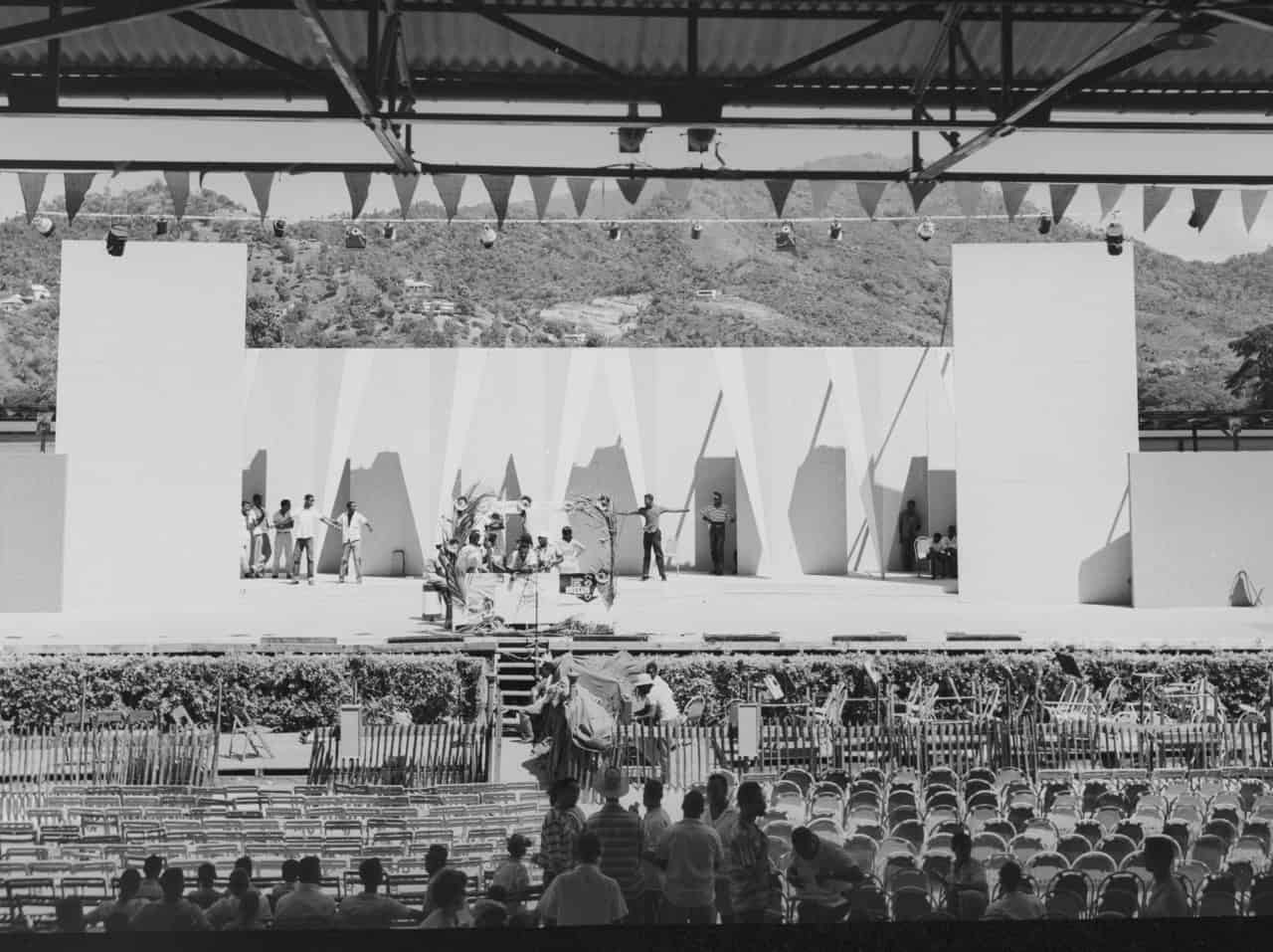
 A 2026 manifesto for Carnival
February 23, 2026
A 2026 manifesto for Carnival
February 23, 2026
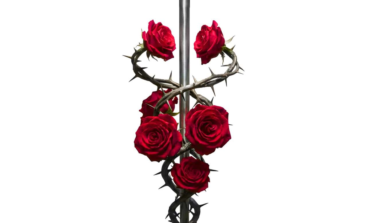
 A hiss from a rose
February 15, 2026
A hiss from a rose
February 15, 2026
 News is a niche until it’s...
February 9, 2026
News is a niche until it’s...
February 9, 2026
 FT’s second Next Gen News report...
February 9, 2026
FT’s second Next Gen News report...
February 9, 2026
 Ransomware report notes fourth quarter 2025...
February 2, 2026
Ransomware report notes fourth quarter 2025...
February 2, 2026
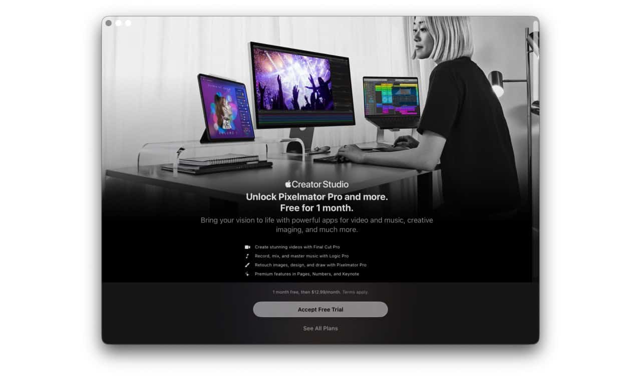
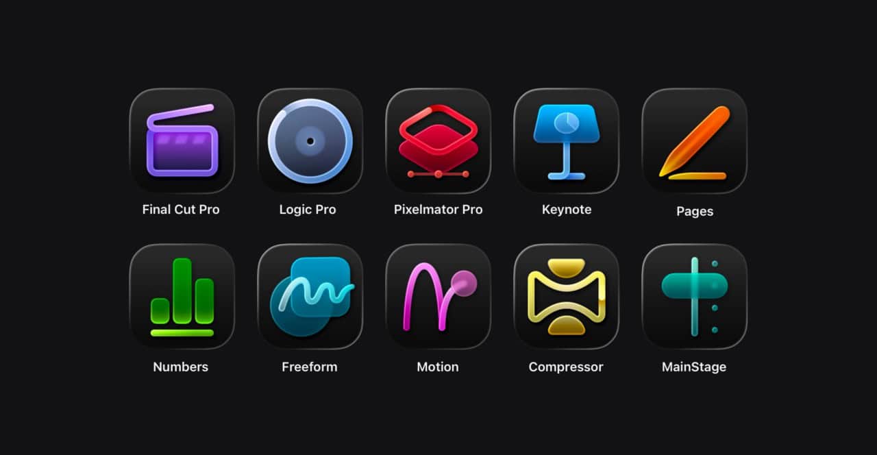
 Hands-on with Apple’s Creator Studio as...
January 30, 2026
Hands-on with Apple’s Creator Studio as...
January 30, 2026
 Apple flirts with subscription software
January 26, 2026
Apple flirts with subscription software
January 26, 2026
 So long, and thanks for all...
January 19, 2026
So long, and thanks for all...
January 19, 2026
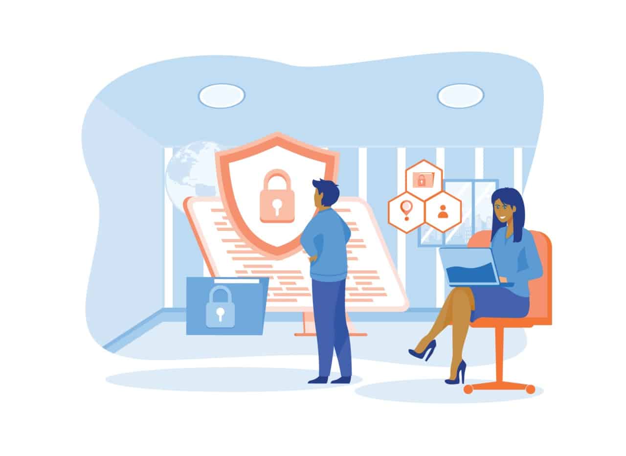
 Cyberedge reports on cybersecurity trends
January 12, 2026
Cyberedge reports on cybersecurity trends
January 12, 2026
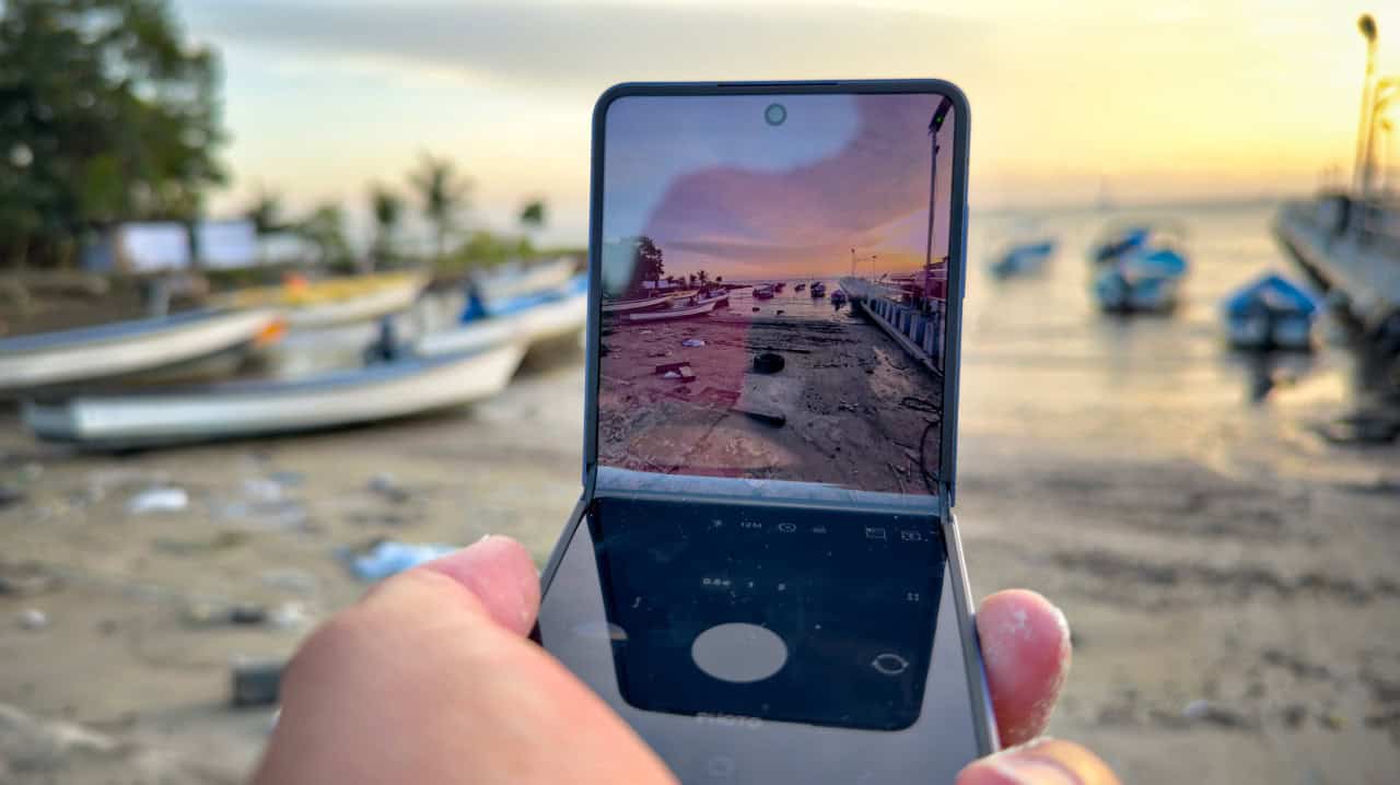
 Samsung’s ZFlip 7 shows steady improvement
January 5, 2026
Samsung’s ZFlip 7 shows steady improvement
January 5, 2026
 Digital New Year’s resolutions
December 29, 2025
Digital New Year’s resolutions
December 29, 2025
 WiPay announces new strategy for services,...
December 22, 2025
WiPay announces new strategy for services,...
December 22, 2025
 Old Mac, new OS
December 15, 2025
Old Mac, new OS
December 15, 2025
 Regional cybersecurity faces fire
December 8, 2025
Regional cybersecurity faces fire
December 8, 2025
 Unfinished symphonies
December 1, 2025
Unfinished symphonies
December 1, 2025
 Do you know who your child...
November 24, 2025
Do you know who your child...
November 24, 2025