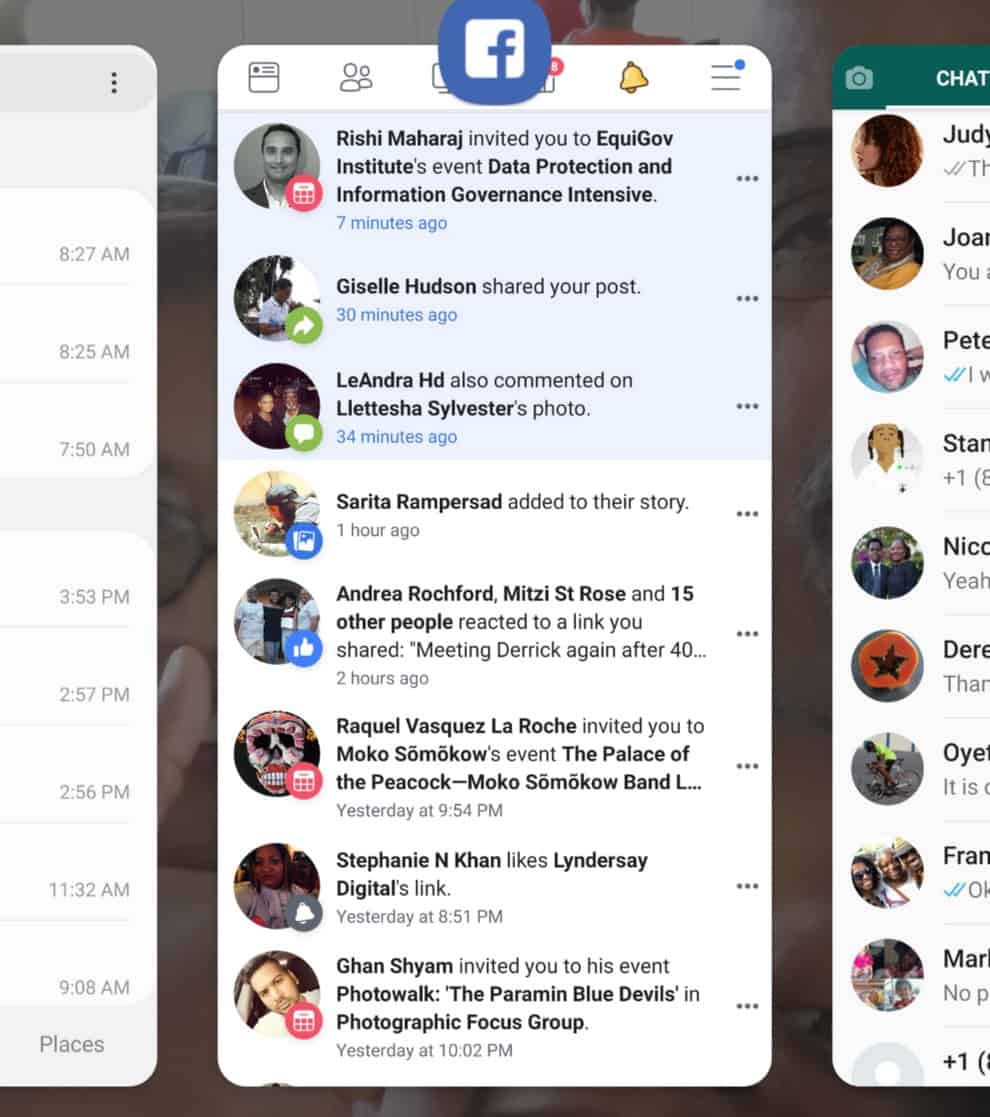
Android Pie introduces gesture based multitasking for running apps.
BitDepth#1184 for February 14, 2019
To be accurate, it wasn’t Google who set up the upgrade to the Android operating system for the smartphone I’m currently testing, at least not directly. It was Samsung’s update.
That’s because most devices in the marketplace running the Android operating system are using a custom version of the core OS with a modified user interface (UI) designed for an identifiable look and feel.
Devices that use bare Android such as Google’s own Pixel series got the version nine update, codenamed Pie, more than six months ago.
The update that showed up last week has some of Pie’s goodness baked in with some nuances and upgrades that offer some insight into what Samsung is likely to be bringing to market with the next iteration of its premium smartphone series, the S10.
My first experience with the new OS wasn’t great.
A few hours after the upgrade, the device began warning of moisture in the charging port.
Since it had been sitting on a mount, plugged in right in front of me for hours during and after the upgrade, I was hard pressed to think of what triggered the alert.
Had the device heated up and somehow drawn moisture out of the cooled air around me?
Had I been breathing heavily in anticipation?
Web searches offered remedies for the problem that seemed sensible in the presence of actual water, though the Note 9 is supposed to be able to take a dunking and keep working.
I unplugged the charger, because the warning chirp was really irritating, and a few hours later, the problem went away.
Had the new OS raised the threshold of the moisture sensors?
Who knows? I’ll just have to keep an eye on the device.
Pie brings you, appropriately enough, icons with more rounded, almost fully spherical corners, a call-back to the early iPhone UI days.

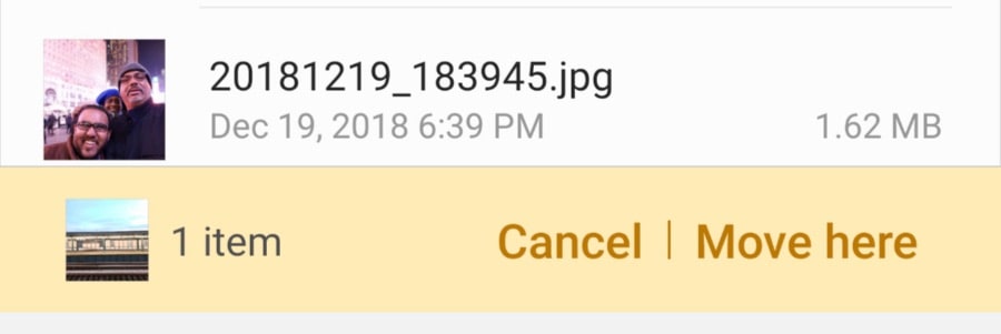
In Pie, the MyFiles file management app offers clearer prompts. 
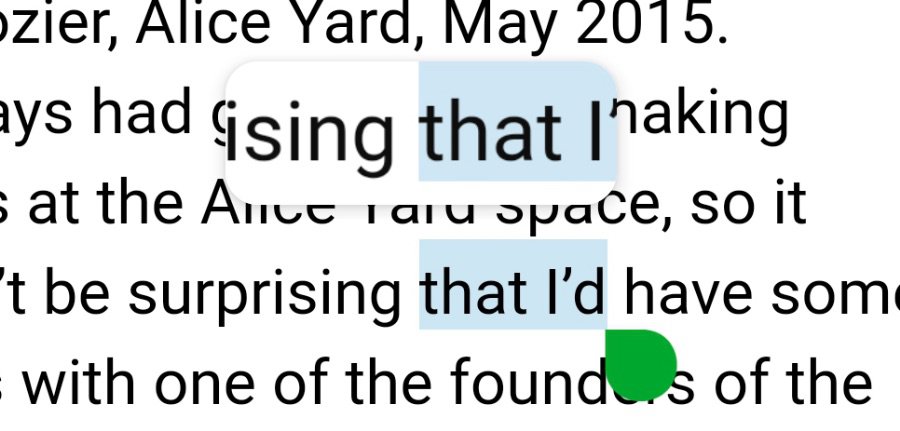
Android Pie’s Text selection magnifier
It also brings to a merciful end the era of file-drawer style multi-tasking windows in favour of a more usable side-to-side scroll that’s much easier to flick through.
If you feel nostalgic for the pack of cards look, Chrome retains that window browsing style.
Samsung has cherry-picked the features it wanted from version 9, dropping enhancements and user features that were a difficult, sometimes contradictory fit for the way Samsung’s Experience UI works.
Samsung has cherry-picked the features it wanted from version 9, dropping enhancements and user features that were a contradictory fit for the way Samsung’s Experience UI works.
So the Dark Mode introduced in the new OS shows up as Night Mode in Samsung’s Settings app.
Selected text is enhanced with a neat horizontal magnifier of the selection area that’s a welcome addition.
The Phone app has also been tidied, though a new Places pane is a solution in search of a problem for me.
System apps have a more unified appearance, and when you open the MyFiles app and Settings App you’ll find an interface that’s laid out as if it came from the same design bench.
MyFiles is also more explicit in prompting a user on how moving or copying files from one location on the device to another works.
The Camera app seeks to address one of my peeves with the Note 9’s dual lens array and offers a graphic of a tree (or maybe it’s a leaf) that indicates whether it’s using the wide angle or longer focal length lens.
You can also pinch and expand the image while taking a photo, and the screen offers you a useful scale that shows when you’ve exceeded the range of the longer lens and are definitely into digital zoom territory.
Unfortunately, the camera does exactly what it did before, which is to take a wide-angle image then in software, crops and resamples it to match the result you’d get with a longer lens.
I tested this with both RAW and JPEG files and while the resampling has been improved, it’s still digital zooming on the image and always inferior to just cropping the photo after capture.
The more you zoom in; the worse the noise and sharpness in the upsampled image become.
Surprisingly, the rather useful video icon next to the still shutter button is gone and switching to video is a mode change bundled with the other options featured in the camera.
In its place now is a selfie button, moved down from a screen overlay. It’s a curious choice, because you can swipe up and down on the screen to switch between the front and rear cameras.
One user interface hiccup is the return of the three software buttons permanently at the bottom of the screen.
There was an option to have these buttons disappear by default in Samsung’s version of version 8, Oreo, but that seems to be gone in Pie.
Notifications on the lock screen seem to have disappeared, but not really.
There are small indicators of activity that when gently tugged reveal a full listing of notifications as well as current settings, a distinct improvement.
Overall, Pie giveth more than it taketh away and the update is supposed to claim a smaller footprint on your device than its predecessor.
If you get an option to do the big update on your Samsung device, I’d say go for it.


