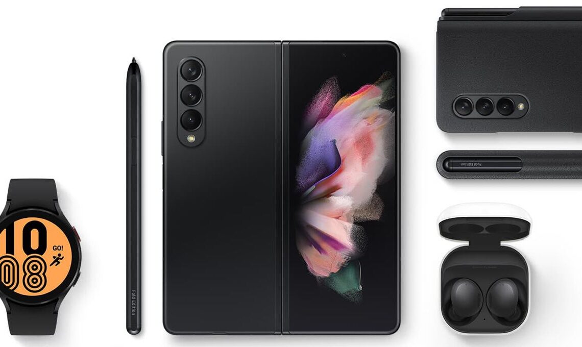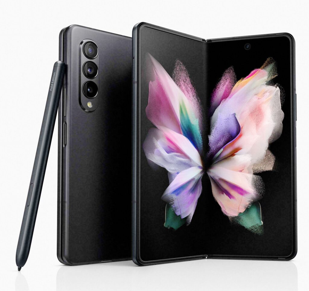
Above: Samsung ZFold and accessories. Photo courtesy Samsung.
BitDepth#1325 for October 25, 2021
I’ve championed smartphones as an all-in-one-solution for the working journalist since their photographic capabilities began to surpass the image-making power of point and shoot cameras.
Larger, crisper screens were a happy bonus.
Over the last three years, I’ve cheerfully photographed, taken notes and while people rambled on pointlessly, polished and prepared online reporting, just waiting for an interminable press event to end so I can hit send.
I can say with absolute authority that the workflow beats, like a Good Friday bobolee, the old system of notes on paper, revisited hours later.
No more fidgeting impatiently while people at a podium stroke their egos, I can just get the work done in one well-managed time slot.
Samsung says a lot about their new ZFold smartphone, and it’s also a working journalist’s dream device.

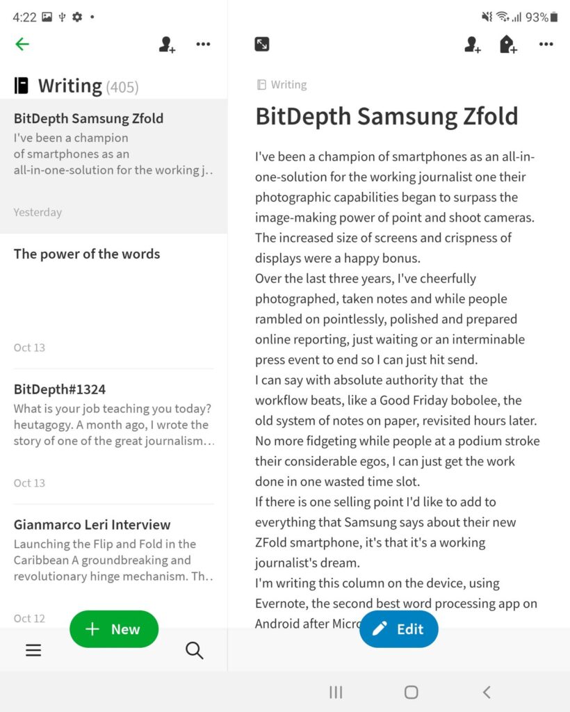
I’m writing this column on a review copy of the ZFold, using Evernote, the second best word processing app on Android after Microsoft Word.
The seamlessness of Evernote’s synchronisation with linked instances on other devices is an important point of feature differentiation.
Whatever I write on the smartphone appears soon afterward in my laptop’s copy of the software.
Evernote hasn’t got Word’s array of tools for working with text, but as a special purpose capture app, it’s almost perfect.
Add in a foldable keyboard and you’re in a very good writing space.
Consider using one with a trackpad since recent Android and iOS devices support cursors on the screen.
The screen on a device like the Samsung S20 is usable, but working with text or preparing an image on the unfolded screen of the ZFold is a transformative kind of temptation.
It isn’t quite like working with a laptop, but while writing, there isn’t a whole lot of difference in the practical working experience.
The cameras in the Zfold are the same pro lens suite that Samsung has been shipping with the S21, so there is no loss in image capture power, but nothing’s gained either.
For an S21 user, the value of the ZFold comes down to the screen, or rather screens, since the device offers a standard screen on its front face (let’s call it the face screen) before you open it.
That screen has been designed as half of the ZFold’s display area but it isn’t the same rectangle shape used on Samsung’s other large screen smartphones.

The Zfold’s face screen seems narrower and taller than the screens on the Ultra versions of the S20 and S21, though it’s actually shorter as well as clearly thinner.
It’s an odd illusion, but an effective one, making the phone appear bigger than it is even before you actually open it to the expansive square that is the main screen.
One curiosity. After you set up that big fold screen square, with the apps you want, you may be surprised to realise that they don’t show up as mirrored on the face screen.
The device treats both screens as separate spaces to be customised with app shortcuts, and it actually makes sense in practical use.
Given the differences in how some users will use the devices in either mode, being able to decide which apps go on each of the two screens is quite sensible.
You can set up the face screen with apps you monitor routinely like mail, messaging and social media software while reserving the big fold screen for work that’s suited to its expansive surface.
As a tool, the ZFold is two premium smartphones worth of battery, processors and circuitry joined by an admirably firm hinge with a 158.2 x 128.1 mm AMOLED screen stretched over it.
That’s an absurdly simplified description of the technology that’s been deployed to make this third generation folding smartphone work as well as it does, but in practical terms, that’s what you pay the big bucks for.
Most apps that are coded to make use of the available screen real estate just fill the screen, including Evernote, Snapseed, Netflix and Facebook.
But one of the things I’d put on the single screen would be YouTube and the movie player VLC, because the big square screen is quite odd for viewing wide-screen video.
You don’t get letterbox black bars; the video floats between large black bands. The only video that looks good here is material shot in the old TV 4:3 format.

Widescreen video looks just as good on the single screen and makes better sense there, because you can fold the screen to your preferred viewing angle on a table.
Compatible apps can open side by side on the big fold screen, but it really isn’t big enough for that.
The half-screen slivers that result aren’t as productive as fast app switching and it’s an effortless exercise on the fold screen to switch between research windows in a book or website window and a word processor.
So easy that I quickly ran over my word limit for this column in one agreeable, uncompromised writing session.
Samsung also really needs to rethink the screen keyboard on the fold screen. By default, it splits the keyboard in half, tablet style, but it’s the wrong decision for the screen, which isn’t big enough to merit it.
Worse yet, there is a customisation option that does an appalling job of closing the space, leaving a river of wasted blank pixels running through the middle of the keys.
The use case for the ZFold isn’t limited to luxurious, pocketable screen space for text.
Excel spreadsheets and digital art projects will also benefit from the expansive pixel real estate, particularly when paired with the new pro SPen.
If your work requires you to take pictures of things, write things, look up stuff on the Internet for reference, package it and send it off somewhere as a digital document, you won’t find many tools that do the job better and will fit in a manly pocket or petite purse like the Zfold does.


